 We just featured a review of Jason Cockcroft’s new novel, We Were Wolves, and now have the author with us to share the stories behind some of the book’s most striking illustrations. Read on for a glimpse into the process of this illustrator, author, and Harry Potter cover artist!
***
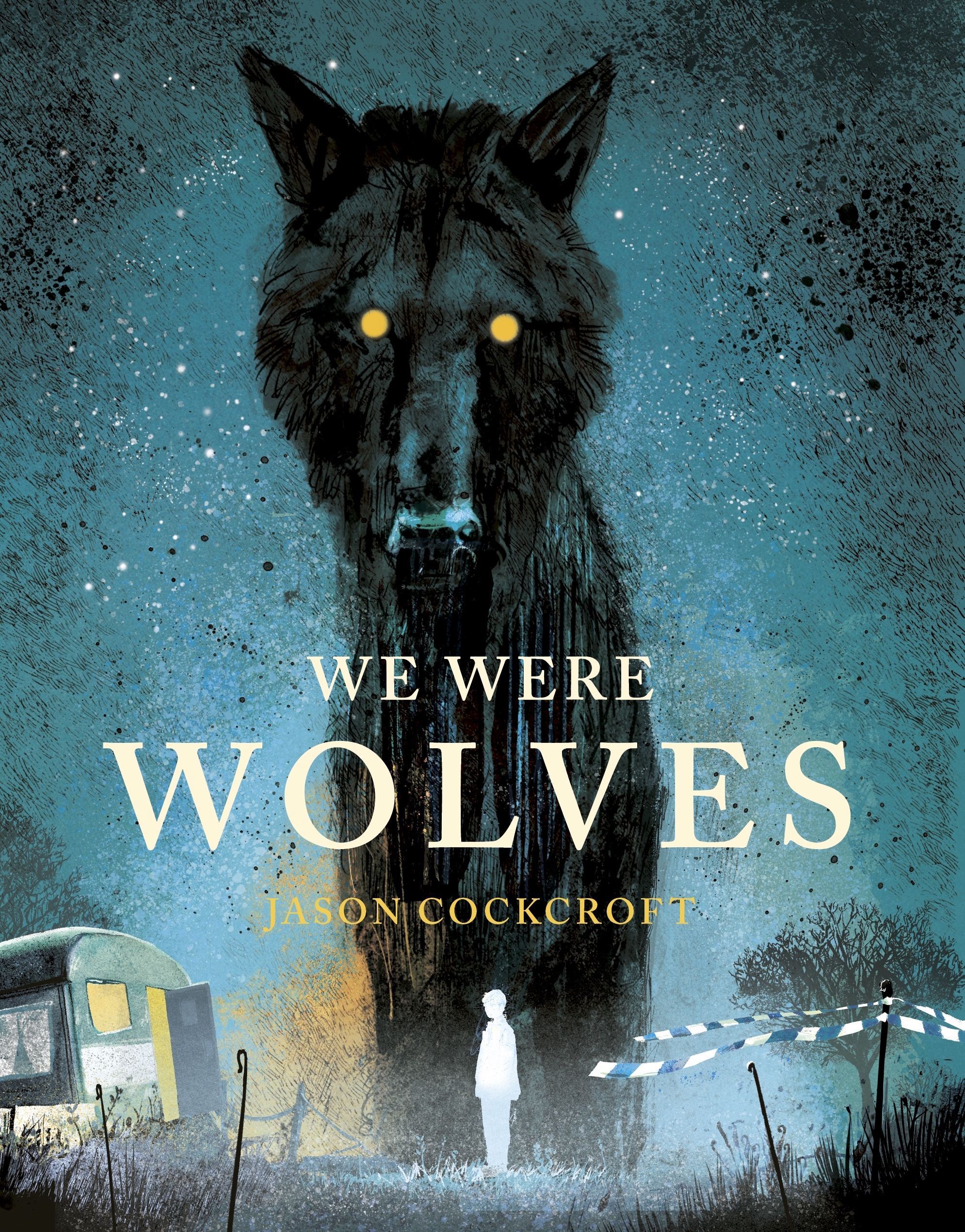
The cover artwork for We Were Wolves came very easily, as did all of the internal illustrations. After discussing around three different concepts for the cover at Andersen Press, this image of the wolf of the boy’s imagination looming over the caravan where he and his father live immediately struck me as the most powerful. In some ways, it could be the cover of a horror story – you’re not sure if the wolf means harm. As with all the mystical creatures in We Were Wolves, it could be benign or malicious because it represents a choice. Every time the creatures of the boy’s dreams appear, he is being asked to make a decision – whether to stay and care for his father in the caravan in the woods or leave, whether to tell the truth or withhold information, whether to flee to safety or take a risk. The symbolic animals represent either freedom or danger, and sometimes they prove to be both. Working on We Were Wolves with the editorial and design teams at Anderson was an absolute pleasure, and I think this is one of the best covers I’ve produced.
I grew up reading comics. They were my biggest influence until I was around 14. Wonderful artists like Brian Bolland, Mike McMahon, Dave Gibbons, and Carlos Ezquerra, who all worked for 2000 AD in the UK at the time, and US comic artists such as Gil Kane, John Romita Jr., and Neal Adams were my touchstones. Later, I fell in love with classic book illustrators. The linework of Harry Clarke, Aubrey Beardsley, and Arthur Rackham is exceptional. Later still came Charles Keeping, and both his linework and his colorwork remain a revelation to me, and I hope I managed to emulate some of his boldness and grace in my book.
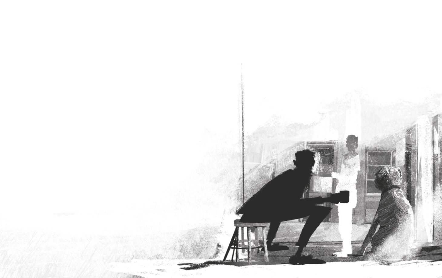
When I was a teenager, mainstream comic artwork changed and became more experimental, and the work of artists such as Bill Sienkiewicz and Dave McKean became enormously influential, incorporating mixed media elements, and sometimes distorting figures and perspective to heighten the drama of a scene. That’s what I was trying to do in the illustration where Toomey, the villain of Wolves, visits the boy in his caravan. His presence in what has always been a place of safety for the boy is disorientating, and I wanted to reflect that in the forced angles of Toomey’s body and the way the boy seems trapped in his gaze.
One of the major features of We Were Wolves as a story is the mix of an ancient mythology involving prehistoric creatures with a very realistic, gritty world that straddles both the small market town in the north, where the boy has lived with his mother before the events of We Were Wolves, and the woods outside town, where he now lives with his father in an abandoned caravan. In the book, these myths are a creation of John, the father, which are then told to, and adopted by, his son, eventually invading his dreams.
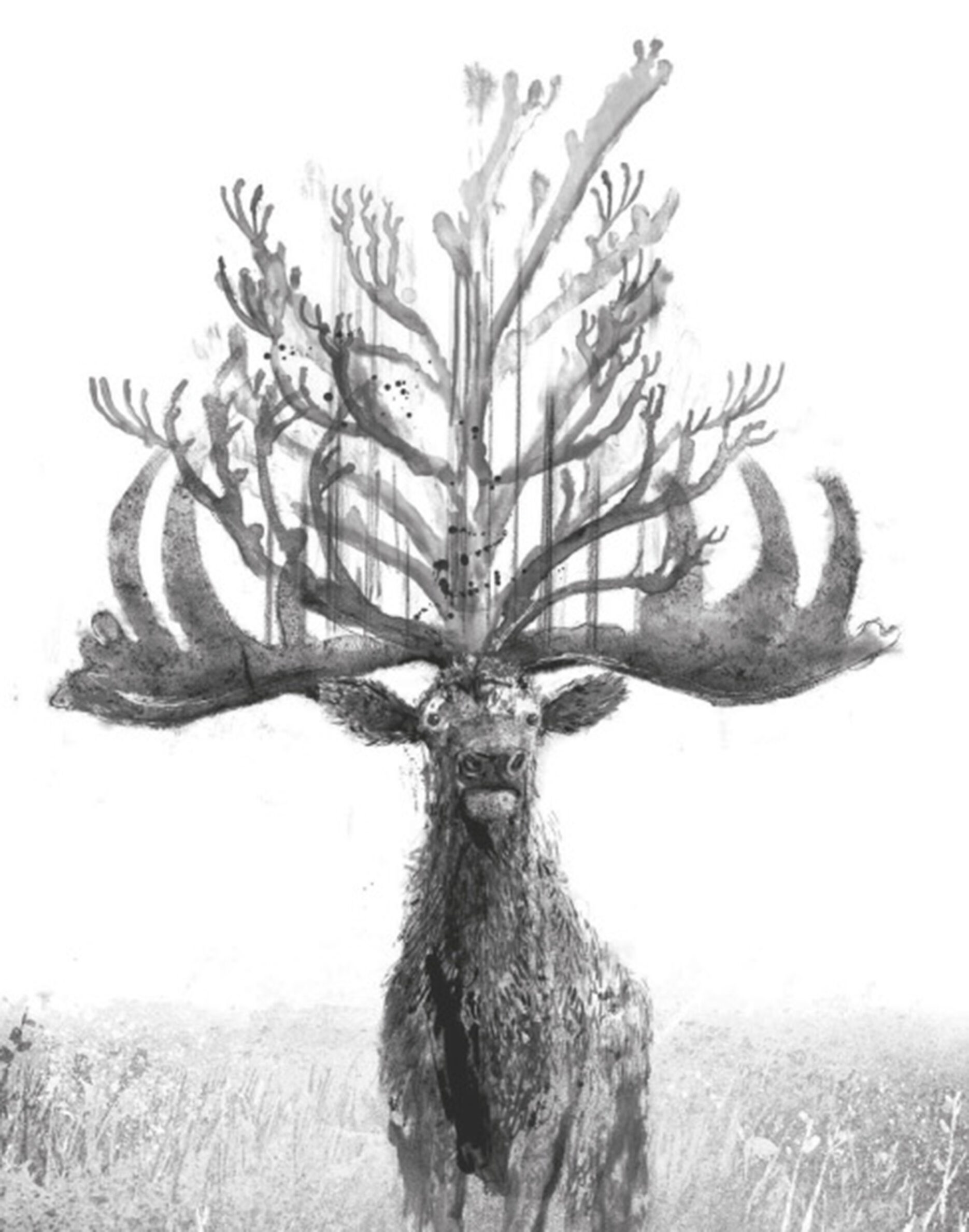
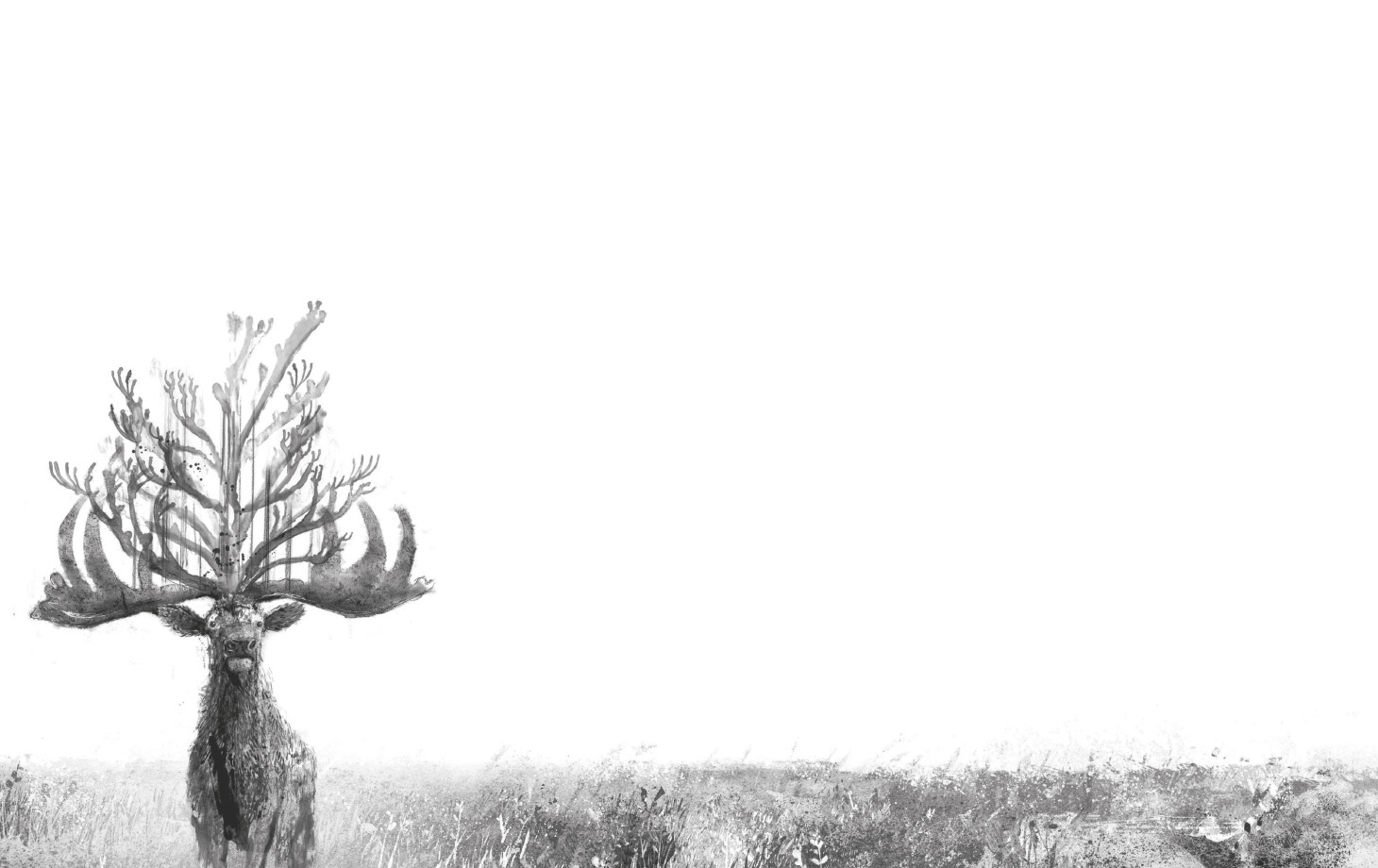
Such elements can be seen as magic realist, but I wanted to avoid gentle, romantic portrayals and present the creatures of the boy’s imagination with as much texture and detail as the surrounding “real” world. The animals of John’s imagination are based on species destroyed by the expanse of human civilization or directly wiped out by hunting and then generally “forgotten” by the modern world. Rather than trying to hold to the more realistic concept of how they would have appeared, I illustrated John’s visions of them. The bison is enormous, by turns glorious and terrifying, passive and violent. The stag, proud and elegant, and bearing the impossibly tall and elaborate antlers that would eventually lead to its extinction. And of course, there are the wolves, who once were wild in Britain, but no more.
A writer isn’t always aware of the common characteristics present in work, but themes always become evident in time. Similarly, visually, I would have suggested there was little or no overlap between my book We Were Wolves and the artwork I produced for the UK Harry Potter covers. Now I realize that Wolves does have something in common with HP after all, and it’s the appearance of a stag.
Harry’s stag Patronus – which appears on the inside flap of the cover of Harry Potter and the Deathly Hallows – has close associations with his family, of course. The enormous prehistoric stag present in We Were Wolves appears to the boy in his dreams and, like the other creatures in the story, is symbolic. The extinct stag, based on deer that existed in Europe hundreds of thousands of years ago as part of the Megaloceros genus, which included Irish elk, represents the tragedy of the boy’s father, John. They were much taller than our current species of deer, and the males bore enormous, outsized antlers for display, which limited movement within woodlands and forest and allowed them to be hunted, leading to their extinction.
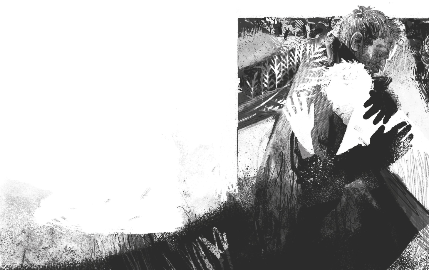
As I said, comics were such a big influence on me growing up. We got most of the Marvel and DC titles in Britain, and my favorites were Spider-Man, Captain America, and Iron Man. But this was the golden age of British comics, too, and it was a British comic called 2000 AD that I loved most. I had always been good at drawing, and inevitably, I began to copy illustrations by the best of the 2000 AD artists, like Brian Bolland, Dave Gibbons, and Kevin O’Neil, who all went on to illustrate comics in the US, with great success. I wrote and drew my own comic stories, too, and let my friends at school read them. Eventually, I moved into children’s book illustration, but my love for comic books continues. This particular illustration of the son and father embracing is central to the story, as it represents not only the love between them but also how much they are reliant on each other. It seemed appropriate to portray such an emotional scene in a way that wouldn’t be out of place in a comic book – it could almost be an illustration I might have created when I was 17 years old.
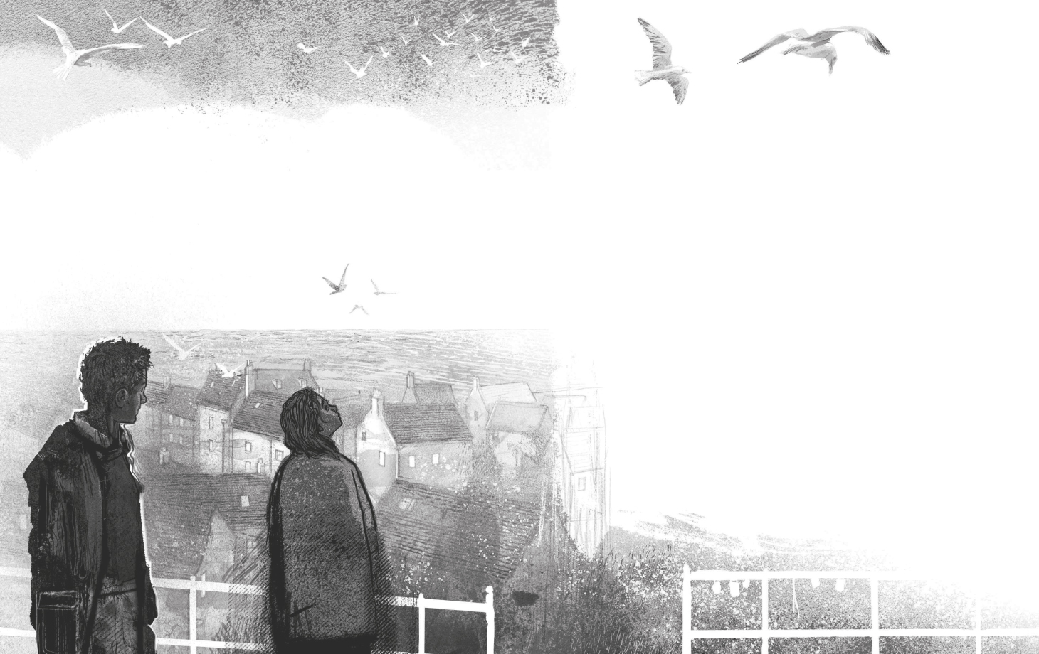
As a child, I was taken often to Whitby on the East Yorkshire coast by my parents. It became my favorite destination, and later, I’d live there for around ten years. The cliff walk between Whitby and Robin Hood’s Bay is still one of the most pleasurable walks I can think of. It seemed apt, when writing Wolves, that John would take his son to Robin Hood’s Bay for a day or two of peace before they embarked on what would turn out to be an ill-fated plan to acquire enough money to escape the criminal life, in which John had found himself trapped. The scene of the boy and Sophie at Robin Hood’s Bay is a little snapshot of the happiness I found there when I was young, and it’s one of my favorite illustrations in the book.
I spend a lot of time walking in nature. Where I live, I’m surrounded by moorland and woods and fields. I grew up on a council estate in Leeds, but like many estates, it was built near brown- and greenfield sites, and so the walk to school took us through a fairly large wood. It’s almost vanished now, eaten away by business parks and industrial estates and by the quarry at its center. But back then, you could walk in every direction for an hour or so. It was that wood I pictured when writing We Were Wolves. When you make that journey in memory, it’s very easy to fall back into the imagination of your younger self, back when nature was everywhere, and it was safe. It was the people outside and the noise of cars or the appearance of strangers in the woods that posed the danger.
I wanted John, the father, to find safety and peace in nature. He’s a man out of time. He’s in conflict with the modern world and would have probably been happier living centuries ago. In the woods, he can imagine a greater peace, an ancient land where creatures that are now extinct might live again. He’s mourning the man he was, perhaps, when he was younger, and that sense of mourning is imposed upon the world that has changed around him. He has a hunger for a greater authenticity – an authenticity he can find in the trees and the soil.
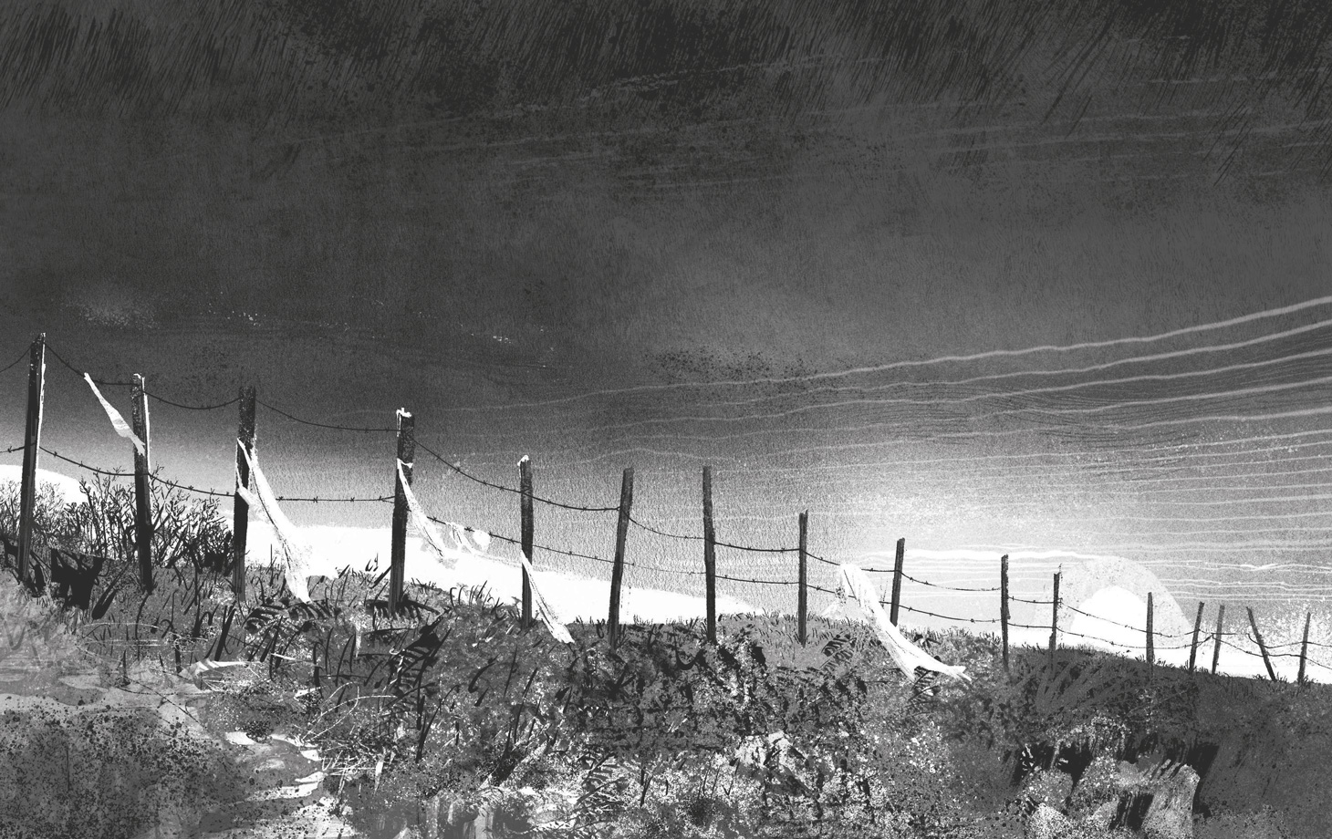
The boy embraces these ideas, and because he admires and loves John so much, he actually begins to see these creatures. He imagines wolves among the trees. And the wolves are him and John, of course, both in danger of becoming extinct. The quarry at the center of the woods represents how John’s fantasy of life away from the pressures of the modern world is just that – a fantasy. The modern world always intrudes and will eventually bulldoze through the woods that were meant to be a refuge. This illustration of the barbed wire across the crest at the edge of the quarry is inspired by a photograph I took over 30 years ago in the woods near where I grew up.
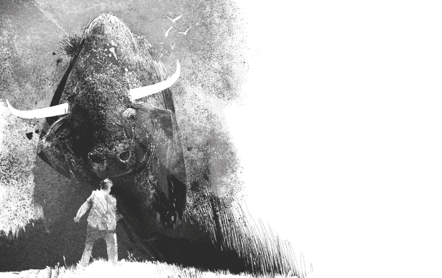
In We Were Wolves, the mysteries of human nature and psychology are depicted by the mythological creatures John, the father, celebrates and mourns. Wolves were wild in Britain, but they no longer exist here, and that will be the fate of the boy and his father, and so the wolves the boy sees symbolize the impossible nature of how they are living. I wanted the wolves to be ghostly, supernatural creatures, embodiments of human spirit rather than real animals. They are the souls of John and the boy, and they appear in times of indecision, before choices are to be made that will lead to either the Gold and Stars John daydreams about or failure and, perhaps, death. The stag represents the father’s tragic ego. The bison in the illustration where Toomey finds his way into the quarry represents the power of imagination and love – eventually, this bison will save the boy, but it will come at a cost. I wanted the creature to look organic, like it had been buried beneath the earth for centuries and was only rising up now because of some great injustice that was about to happen.
***
Thank you, Jason, for taking the time to share a bit more about the book with us! We Were Wolves is available now – you can get your copy using the links below.

